Category: PORTFOLIO
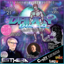
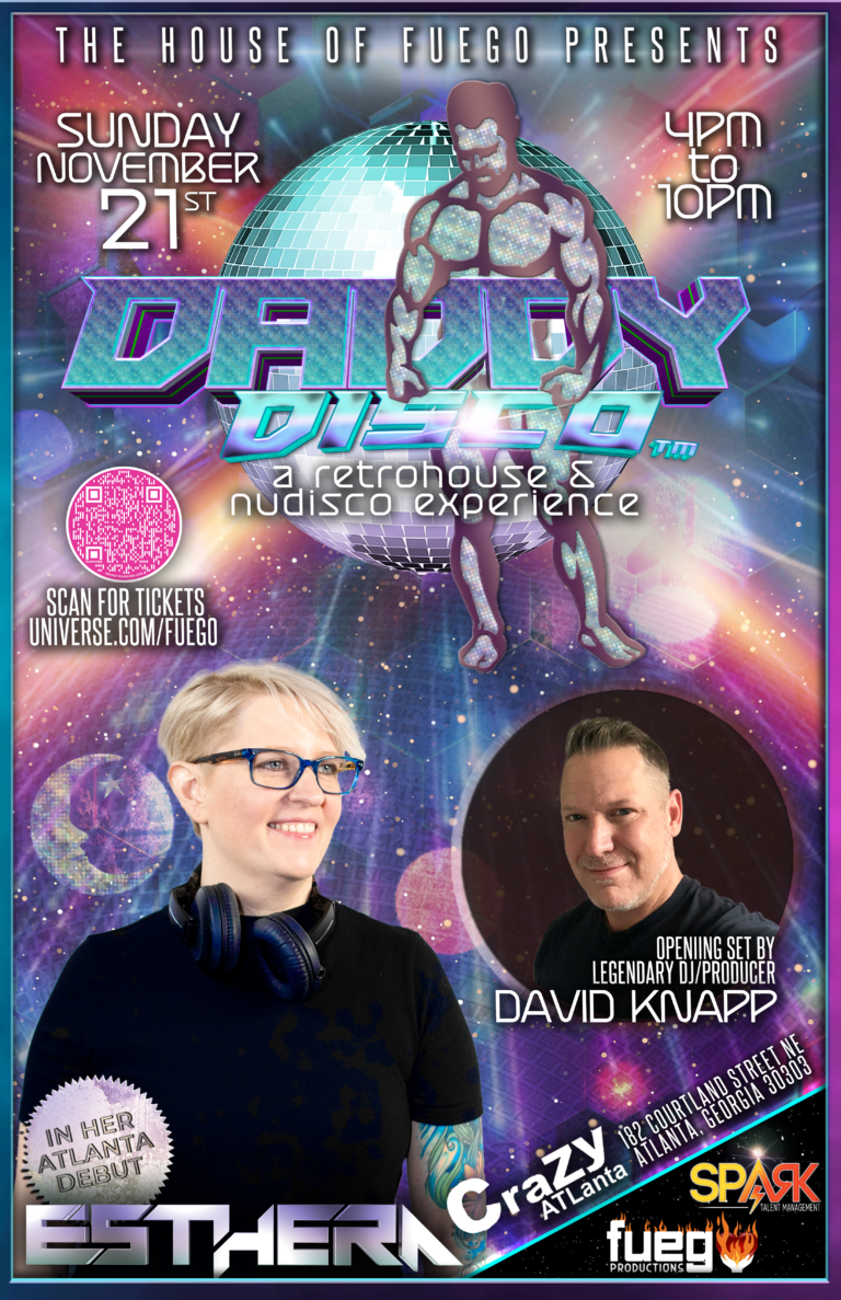
Daddy Disco Event Flyer
El Tigre Set Cover
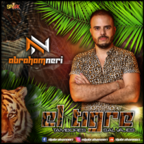
El Tigre Set Cover
Part of my management services with Spark Talent Management includes graphics for my deejays, whether that be logos, flyers, or set albumbs. Here is one of the first set flyers I did for Abraham Neri after I signed him.
Logo Design for Abraham Neri
Logo Design for Abraham Neri
As part of my Talent Management agency, Spark, I offer free graphic design to all of my talent, including logo creation or revision.
So when Abraham and I started chatting about the possibility of me managing him, the told me that he had a designer doing a logo for him already. Skip forward a couple months, and the designer still hadn’t given him any sort of progress on his logo, so I told him that I would take over the design.
After quite a few rounds of samples, he chose the purple and white TEXT+ICON logo that is pictured above in the header.
The brand standard of the logo is the purple and white you see, but I created a couple different color variations of it, which I’ve used on some of his SoundCloud set covers so that it blended with the design of the cover.
The logo itself lends itself to infinite variations, which is a characteristic I like to build into all my logos (if the branding allows for or warrants it).
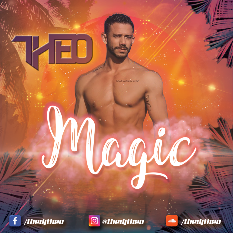
Magic Set Cover
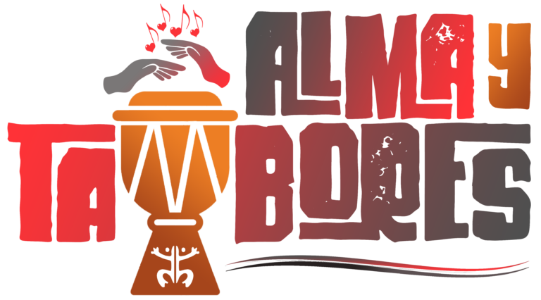
Logo Design for Alma y Tambores
Logo Design for Alma y Tambores
Because Carlos (the other founder) was Puerto Rican and his heritage was also an influence for their sound, I wanted to incorporate the Taino symbol for the coquí, Puerto Rico’s very vocally recognizable frog, somewhere within the design as well.
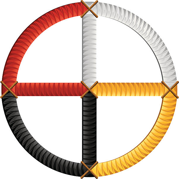
The color palette was inspired by the 4 colors of the Native American medicine wheel, pictured below, and the final logo is picture above.
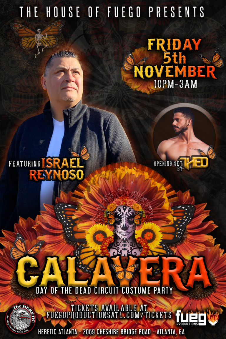
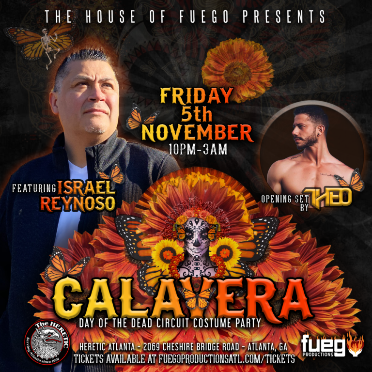
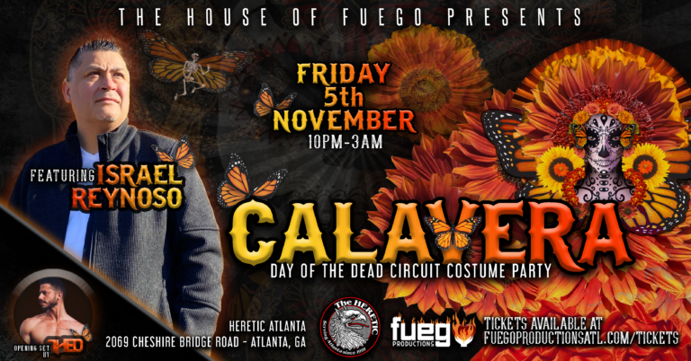
Logo Re-Design for Israel Reynoso

Logo Re-Design for Israel Reynoso
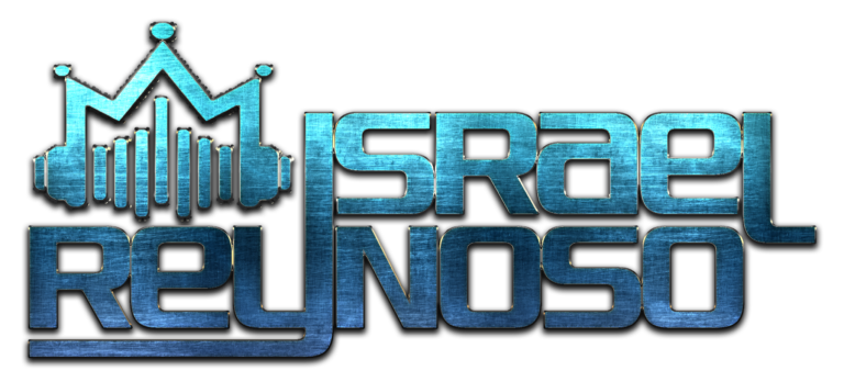
When I signed Israel to Spark, he already had a logo—one that was well-crafted, but rather simple and didn’t create any sort of recognition beyond his name. One reason why brands like Nike or McDonald’s are so recognizable is because of the icons associated with the brand that standalone from the name itself. I wanted to create a logo that contained iconography that could stand apart from Israel’s name. Reynoso comes from the Spanish word, Rey, meaning King, and what better way to depict that meaning than a crown? And when I think of deejays, the crown all of them wear is the unforgettable headphones required for the job—combine those two symbols, and you have a the icon you see below: a pair of headphones in the shape of a crown with audio waves mimicking the shape of that crown as well to eliminate as much negative space as possible, keeping the logo compact easily-identifiable.
OLD LOGO

REDESIGNED LOGO
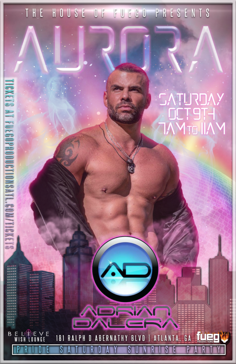
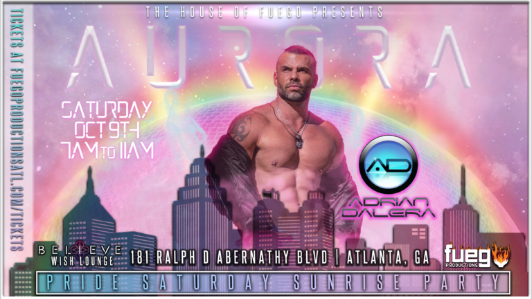
Aurora Event Flyer
Velvet Room Logo
Velvet Room Logo
SUSAN recently relocated her studio area from her basement (dubbed The Underground) to a brighter room in her house. With the addition of some swanky new wallpaper and a fresh, formal style, her new studio became The Velvet Room, so she obviously needed an updated logo for her updated space.
Funnily enough, I had started this logo already, meaning to surprise her with it, and even managed to choose the exact name she picked for the new space… apparently we both felt it was most fitting.
The plum variation you see is the official logo, but I gave her a few different variations, including some with backgrounds to use for scenes in her livestream broadcasts.

