Velvet Room Logo

BLOG

Velvet Room Logo

SUSAN recently relocated her studio area from her basement (dubbed The Underground) to a brighter room in her house. With the addition of some swanky new wallpaper and a fresh, formal style, her new studio became The Velvet Room, so she obviously needed an updated logo for her updated space.

Funnily enough, I had started this logo already, meaning to surprise her with it, and even managed to choose the exact name she picked for the new space… apparently we both felt it was most fitting.

The plum variation you see is the official logo, but I gave her a few different variations, including some with backgrounds to use for scenes in her livestream broadcasts.

Logo Design for Rick Corbo

Logo Redesign and Rebranding for Alexander L’Ancresse

BLOG

Logo Redesign and Rebranding for Alexander L’Ancresse

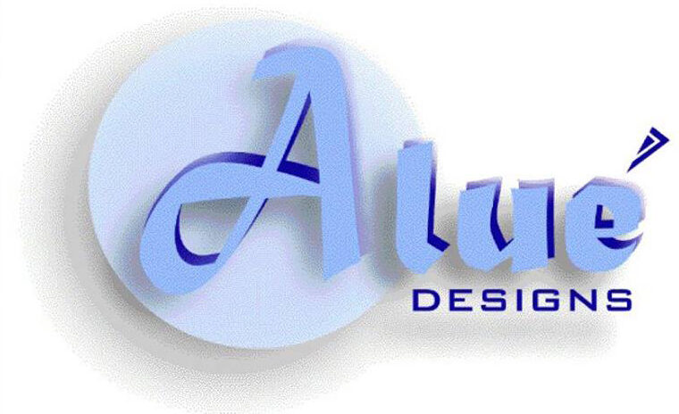
Previously called Alué Designs, Alexander wanted to rebrand his fashion brand to include his name and an icon that would stand out and be recognizable without needing the full name.

He has always had an affinity for anchors—to their purpose, something that has kept him grounded. Given his Guatemalan heritage, I originally suggested a Spanish derivative of “anchor” to pair with his name (Alexander De Las Anclas), but he wasn’t a fan.

He suggested doing a French or Italian derivative since Paris and Milan are two of the top cities for Fashion, and we finally landed on Alexander L’Ancresse.

OLD LOGO

NEW LOGO & icON

Logo Design for Tres Duquesas

BLOG

Logo Design for Tres Duquesas

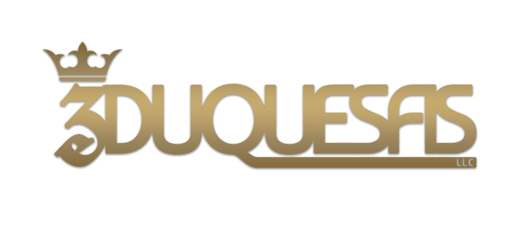
When I was approached by the client, they had no name in mind for their Real Estate holdings company.  Knowing the client personally, I wanted to give a hat-tip to both his heritage and the love of his three nieces, individuals who he adores and treats like his little princesses—or, in this case, duchesses. While the logo only shows the number 3, the name of the holdings company, Tres Duquesas, is a bit more melodic and has a rhyming elements, making it easy to remember.

The logo is pictured below.

Logo Design for Rapid Service International

Wick Wellness Logo Touch-up

BLOG

Wick Wellness Logo Touch-up

I kept catching glimpses of Chad’s logo on social media, and I loved it; but something seemed off in the alignment, to my eye at least, so I approached him and pointed out what I was seeing and offered to give it a touch-up.

I used the double Ls as the alignment point for the rest and turned them into a candle, which also served as the “i” in WICK. I also increased the weight of the font, aligned the two Ws, and condensed the logo, eliminating a lot of the blank space, making it more readable with a quick glance.

OLD LOGO

NEW LOGO

#QUADSQUAD Logo

BLOG

#QUADSQUAD Logo

WHEN DJ Deanne first moved all of her livestream shows to Twitch, I was a little sad because I thought the social outreach wasn’t as great as Facebook, but with Facebook LIVE becoming more and more problematic for streaming, the social outreach was a moot point, and the following on Twitch continued to grow.

As it turned out, Twitch had other perks that Facebook did not have: the ability to RAID other streamers with similar streams and build a bigger community of likeminded individuals.

Shortly after Deanne joined the Twitch community, she joined another—the #QuadSquad, and among the three other members of the QuadSquad were   Susan Esthera & Rick Corbo.

While Susan didn’t commission the creation of the QuadSquad logo, she was the first member I showed the logo to after creating a more concrete icon for the Thursday Twitch foursome to place on one of Deanne’s flyers.

Logo Design for GIldmore Realty

BLOG

Logo Design for GIldmore Realty

WHEN the world was locked down during COVID, my husband and I both agreed that we needed to diversify our income and decided to enroll in real estate courses.

Neither of us finished the course, unfortunately, as we decided a year later that we would be relocating from Atlanta to Tampa, but I designed a logo for our team before that was ever decided.

Inspired by the Biltmore Estate in name and aesthetic, we chose the name Gildmore because we imagined an upscale, luxury focus for our team.