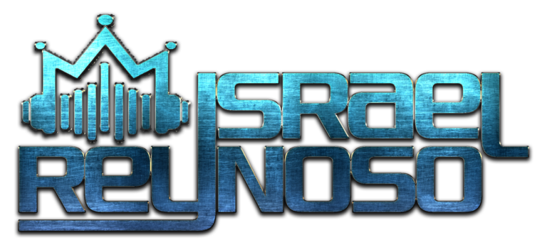
When I signed Israel to Spark, he already had a logo—one that was well-crafted, but rather simple and didn’t create any sort of recognition beyond his name. One reason why brands like Nike or McDonald’s are so recognizable is because of the icons associated with the brand that standalone from the name itself. I wanted to create a logo that contained iconography that could stand apart from Israel’s name. Reynoso comes from the Spanish word, Rey, meaning King, and what better way to depict that meaning than a crown? And when I think of deejays, the crown all of them wear is the unforgettable headphones required for the job—combine those two symbols, and you have a the icon you see below: a pair of headphones in the shape of a crown with audio waves mimicking the shape of that crown as well to eliminate as much negative space as possible, keeping the logo compact easily-identifiable.

